It Ain’t No More To It: 4thlettered!
April 26th, 2011 by david brothers | Tags: frank quitely, it ain't no more to it, moebiusstarted one minute into Saul Williams’s “Tr(n)igger.” 2245 on 04.25.11
Lettering in cape comics tends to suck. I don’t mean that it’s not technically proficient, because it is 99% of the time, but that it’s boring. Lettering is a vital part of comics. It’s an information delivery system, and too often, it’s treated more as USPS than… I dunno, a singing telegram or something that delivers something with some panache.
My eyebrows always sorta narrow when I see word balloons in comics that were taken straight from Comicraft’s site. It gives books this same-y, bland feel. There’s no personality in there, when the letters should definitely have some. I mean, the letters are supposed to represent people’s dialogue, right? I’m not asking for every character to have a distinctive word balloon (thought it was dope when Johnny Storm and Bobby Drake had fire and ice-based balloons back in the Onslaught days), but something more than the default white balloon would be nice, wouldn’t it? I like when you can see the gravel in Ben Grimm’s voice right there on the page.
Letterers like Stan Sakai, John Workman, Tom Orzechowski, Dustin Harbin, and Jared K Fletcher tend to do it right. Their splashy, interesting balloons add to the art, rather than interfering with it. The balloon tails meander and wiggle, rather than coming to a perfect 30 degree angle or whatever. Font sizes vary, balloon shapes warp, and on and on.
Sound effects are one of those things that I feel should be handled by the entire art team, not just the letterer. There’s nothing like seeing sfx integrated into the art. It makes the art just that much more exciting, just a little more like the platonic ideal of comic books. I do like books without sound effects, but if you’re going to use them, why not use them? Make them pretty, not just a Photoshop (Illustrator?) level on top of the colored art. Sketch in a “thwip” or throw a big fat “BOOM!” behind a punch. Let the sound effect serve as your panel, like this bit from Kathryn Immonen and Tonci Zonjic’s Heralds.

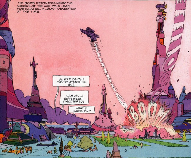
I read Moebius’s The Airtight Garage the other day. It was fantastic, as expected, but what leapt out at me maybe the most was one sound effect in this panel partway through, the boom:

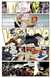
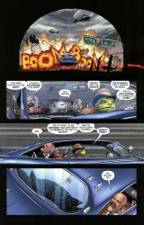
Because oh man, Frank Quitely totally used that in his run on Batman & Robin, didn’t he? This is nothing, just four letters and an explosion separated by publishing company and probably 20-some years, but it creates an interesting link between two works. It’s interesting, and it doesn’t dominate the page or look like it doesn’t belong. It’s part of the page, and it’s interesting.

Marvel does this thing that I hate. I think it’s a company-wide general rule for books of a certain rating, but I haven’t put any real study to it. Pure anecdotal, whatever whatever. When someone gets stabbed or shot, the exit wound is almost always covered by a big ugly sound effect. Not all the way covered, but significantly so. It bugs me so much, because it’s just another reminder that I’m reading a comic book that’s stuck pretending like it’s for children. It’s positively graceless. If you can’t show something, why do it and then hide it? There’s got to be a better way.
finished two and a half minutes into Saul Williams’s “NiggyTardust.” 2258 on 04.25.11

Orzechowski’s stuff is always fun to look at. I know the book doesn’t get much respect, but he adds quite a bit to Savage Dragon’s style. I actually think he brings that book home in many ways.
And yeah, I like Savage Dragon. No shame.
I’m enjoying these brief writings. Keep ’em coming.
@Alec Berry: He’s been doing Spawn for years upon years now. His stuff is so distinctive and nice. I wish the Big Two employed him more. He’d work wonders.
Orzechowski still hand-letters everything. I believe that he’s been on Spawn since the beginning, I didn’t realize he was on Savage Dragon, too.
My most hated kind of SFX you see in Marvel comics (maybe DC, too) is the giant, hollow outlined letters that take up a whole panel. Just present enough to obscure the art, without being at all readable or interesting. Pointless.
Marshall Rogers used to do stuff like that “boom” all the time, too.
>It bugs me so much, because it’s just another reminder that I’m reading a comic book that’s stuck pretending like it’s for children.
Or vice versa.
Man, that plane’s RRRRRROOOOOOIIII is the shit, isn’t it?
One thing that used to bug the hell out of me in superhero stuff that I’m glad they don’t do nearly half as much is using a character or group’s logo in dialogue. Someone would yell “IT’S… WOLVERINE!” and it would be in his logo. Really made you remember that on some level these are the adventures of disposable action figures.
@Lugh: haha, I’m sorta re-reading some 1990s Marvel comics and I think it’s hilarious each time they do that. “Hilarious” in that bad, condescending way that we look upon the modes and trends of the past and chuckle our derision.
@David: I think that when they cover up the exit wounds in Marvel Comic impalations, I just want to give all of Marvel Comics a condescending pat on the head or light punch to the shoulder. “Aww, you’re so tuff,” I would say.
When it comes to self-censorship, they had a good style at one point in which the stab-victim’s shirt would cover up the exit wound. I mean, you’d see Wolverine punching someone in the stomach, and vaguely claw-shaped protrusions would be stretching the victim’s shirt on the other side. It gets the point, avoids the graphic depiction, and doesn’t presume that the reader is a fucking idiot.