
7 Artists: Ed McGuinness
July 4th, 2010 by david brothers | Tags: 4321, ed mcguinness, grant morrison, hulk, jeph loeb, secret warriors, wonder woman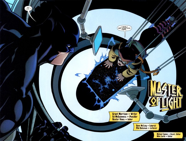
JLA Classified 1-3 is the perfect superhero story. As far as stories about tights and fights go, it is top notch and one you can point to that has almost everything that makes superhero comics work. Grant Morrison supplies a script that’s packed with jet apes and killer robots, but Ed McGuinness, ably assisted by Dexter Vines and Dave McCaig, knocks the ball entirely out of the park with his art. Without McGuinness, this wouldn’t be half as good as it is.
 For a long time, Jim Lee defined comics art for me. Todd McFarlane drew my first comic, but Lee did X-Men 1, which blew the roof off superheroes for me. His characters were tall, imposing, built, and attractive. They were the movie stars of comic book heroes. They aren’t as weird as McFarlane’s creepy take on Spider-Man, they were more realistic than Jack Kirby’s work, and they looked like they were chiseled, rather than drawn. They looked like the end point of the superheroic ideal, beautiful people doing powerful things.
After I came back to comics after a long time away, Ed McGuinness soon took over Lee’s spot. His take is even less likely to appear in real life than Lee’s, but something about his squat, muscular, and clean take makes superheroes look like they should. There are touches of CC Beck and Curt Swan in his work, but McGuinness never looks like a Silver Age throwback. There’s definitely some of the Image “muscles upon muscles” in his work, but it doesn’t ever look garish.
McGuinness’s superheroes look like cartoons, which is an astonishingly good take on the genre. Hyper-real superheroes look ridiculous, as a glance at any superhero movie you care to name will tell you. Superhero comics indulge in larger-than-life theatrics more than any other kind of book I can think of, and McGuinness’s art reflects that.
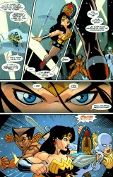
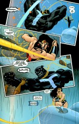
The most striking thing in these two pages are Wonder Woman’s eyes on page one, panel four. They’re made of very simple lines, free of wrinkles, and with the barest hint of a furrowed brow in the center. Instead, her eyebrows do all the talking. They’re unnaturally cocked high, aren’t they? Page two, panel two features Wonder Woman breaking the panel border as she flexes and pulls her lasso taut. Her back muscles are drawn in thick and large, but her hair is a solid mass of black. There’s no noodling or unnecessary details to gum up the works. He draws a lot of details, from pouches to cracks in armor to wrinkled cloth, but he always stops short of over-rendering. His characters are simple, with strong silhouettes and lantern jaws.
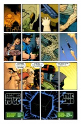
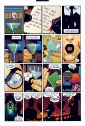


His storytelling is clear as a bright summer day, too. This story takes him from hyper-compressed sixteen panel grids to wide open two page spreads and he handles both of them with ease. McGuinness has never had a problem with readability, and his sense of panel to panel progression is impeccable. He repeatedly uses characters as part of the design of his pages in this story in particular, and it never stops being anything but good. When things go all sideways and his panels start twisting and turning, it’s to emulate a high-speed mid-air dogfight. At the end of the fight, when a laser goes straight through Squire’s arm, the panel is straighter than a ruler.
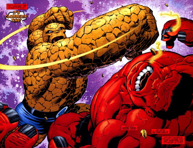
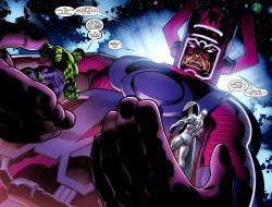 In the years since JLA Classified came out, McGuinness has been working mainly with Jeph Loeb on Hulk
. He has introduced several new elements into his style, making his style less cartoony than it used to be, but still clearly his style. If JLA Classified was the Saturday morning cartoon, his work on Hulk and a few other comics since then is the big budget feature film.
On Hulk, he’s working more details into his art, embracing several techniques he didn’t employ previously, and upping the spectacle in his work by several orders of magnitude. Everything is bigger. The figures are more detailed and more traditionally expressive. What’s notable about these style changes is that McGuinness manages to do all of this without breaking what made his style so attractive in the first place. The figures are less simple than they were in JLA Classified, but no less recognizable and attractive.
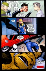
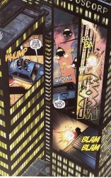
Watching McGuinness on Hulk is kind of like watching Miller on Sin City. You can see where he’s pushing against his limits, bringing in outside influences or diverse styles, and still keeping it all within what you could call his style. He’s still doing interesting layouts, particularly in the Secret Warriors special he drew where Nick Fury and a friend engage in a midair dogfight as displayed on the sides of a few skyscrapers or when characters break the panel borders in Hulk.
McGuinness is definitely what pops into my mind when I think of a generic example of superhero art. Kevin Maguire’s strength is accurate facial expressions, and Frank Quitely is fantastic at body language, but McGuinness’s characters look like superheroes should look. Big, beefy, cartoony, and exciting. His strength lies in accomplishing that without sacrificing storytelling on the altar of pin-ups and so-called iconic shots. He knows how to tell a story, and often delivers work that completely out-classes the scripts he’s given to draw. As time goes on, he becomes more and more versatile and that’s what makes his work worth checking out.
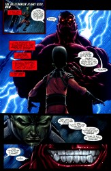
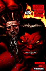
You don’t get sub-par or uninteresting work out of this guy, and every time he takes a short break, he comes back with something new. Credit is also due to his inkers, usually Dexter Vines or Mark Farmer, and colorists, Dave McCaig, Dave Stewart, Jason Keith, and Morry Hollowell. They bring out a lot of the details McGuinness puts into his art, and you can tell that they’re a complementary team. Together, they do powerhouse work.
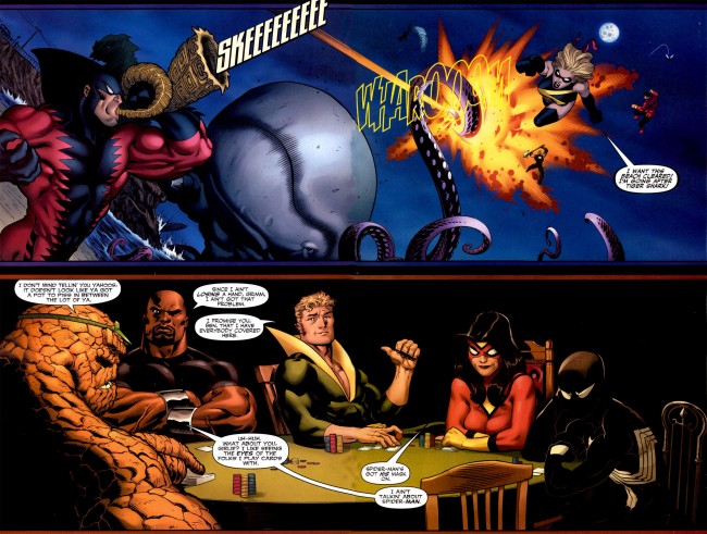

I always like to see McGuinness’ art, and I love his rendition of the Squire. I’d pay a pretty penny (if I had a pretty penny) for a sketch of her by him…
I just CAN’T stand the immense jaws he draws for all of his male characters. It’s all I see each time I look at his art.
His art always is attractive and exaggerated, but the storytelling is so-so. In his first storyline of World’s Finest, he introduces a group of supervillians, but uses a long shot. So for some of the villains, the opening shot of them is tiny–then there’s never another full shot of them and their costume. An artist needs to establish what the villain looks like in his costume so you can tell who’s getting beat up!
He also is so married to his style that the civilian characters are drawn enormously too. There’s no contrast between the superhero and the supporting cast if Pa Kent is as large as Clark.
The Hulk is the best title for him–few civilians, almost the entire cast is huge, everything is big. Sometimes an editor makes a great decision of artist for a book–this is one of them! Too many DC editors think the artists are interchangeable, so you often get grungy art on Superman or pretty art on Batman. This is fine for occasional issues, but not great casting long term.