
What I Don’t Know About Comics Art Could Fill Oceans
May 2nd, 2011 by david brothers | Tags: adam warren, grant morrison, yanick paquetteI thought this fight scene from Batman Incorporated 5 was pretty straight. Art by Yanick Paquette, inks by Michel Lacombe, colors by Nathan Fairbain, words by Grant Morrison, letters by Pat Brosseau:
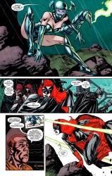
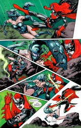
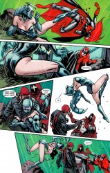
It’s not really as elegant as some of the stuff Quitely did in his run on Batman & Robin (digital, trade), or as visceral as Cameron Stewart (digital, trade
) got when Batman and Robin visited London. Taken as a series of discrete moments, it works, and it’s pretty easy to animate this in your head. I only have trouble on page 2, panel 5 leading into panel 6, but it’s clear more time passed between those panels than it did between, say, panel 2 into panel 3. I do like how those twin rocks in 2.3 serve as reference points for how the fight moves around in space. That’s a great idea.
The money panel is page 3, panel 5. It’s the only real moment of pain in the entire fight scene, I think. The other panels were very give-and-take, this sort of playfighting kinda thing. 3.5 is crucial, though. Paquette captured that moment in time perfectly, with a painful looking awkwardness in Scorpiana’s posture and surprise in the body language of El Gaucho and The Hood. Even the shock lines–what are they actually called?–are dead-on, and Scorpiana’s helmet coming off is the icing on the cake. While the fight isn’t all the way there for me, that bit? 3.5? It makes the scene for me. The only thing I would do is swap the “Ouch” for a balloon coming from Scorpiana that’s either empty, filled with squiggles, or a breath mark. I always liked how that looked, and it’d sell the interruption of the action even more.
Okay. Here’s the thing.
I’m not an artist. Well, not any more–I spent some time in high school putting together a portfolio so I could go to art school, but then I discovered I could write, blah blah blah who cares. I’ve got no training beyond binging on books and art theory online. I don’t know near enough about comics art.
Here’s the proof.
Over on his Twitter, Adam Warren posted a link to an old DeviantArt post about how he draws Empowered (digital, trade). This is the sort of thing I eat up, because it’s the real nuts and bolts of comics art. It’s behind the behind the scenes. I was really interested for the first few paragraphs, because it’s all about format and readability. This is basic, basic stuff, but it’s the building blocks of comics. “You have a blank page. What is your first step? How does that step affect your work?”
(I think about format a lot, both in other people’s work and my own. Especially my own; I struggle with the way I use images. Ask me how pleased I am with that (digital, trade) stuff up there. No, don’t, because the answer is “it sucks and is ugly but I don’t know how else to massage that data into the post, barring an even uglier list at the end of the post.”)
It’s the fourth paragraph that blew off the top of my skull, though. Here’s the relevant bit:
Note that there’s one more step I could take to make EMPOWERED even more readable… Namely, I could use “manga gutters” on its pages. In manga, the vertical gutters between panels are very thin and the horizontal gutters are VERY thick (usually in a 1:3 vertical: horizontal ratio), in order to ensure that the reader’s eyetrack stays on a particular (horizontal) tier of panels and doesn’t stray down to an out-of-sequence panel below.
Got any manga nearby? Pick it up, flip to a random page, and look at it. That’s what I did immediately, and since I live in a fire trap, I did it a couple more times, too. If you can, find one of those pages that has three panels that take up the top half of the page–two squat panels stacked on top of each other and one tall panel beside them. Or here, look at these images I pulled from Katsuhiro Otomo’s Akira ages ago:
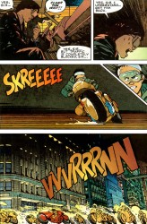
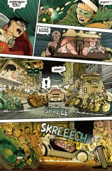
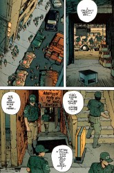
Do you see this? Isn’t it unbelievably obvious? It’s the kind of obvious that makes you feel dumb. I own a ton of manga. I almost don’t want to move because it probably weighs an actual ton, and I never noticed this. Look how huge those horizontal gutters are. The panels are swimming. It’s such a little thing, the sort of thing you’d never spot unless you were looking for it (or good at your job), and it means so much.
It got me thinking. I grabbed Barbucci and Canepa’s Skydoll: Spaceship, a collection of short stories, and flipped through. It was a mix of manga gutters, regular gutters, and gutters that were irregularly applied. Some gutters were pencil thin, while others were super chunky. I opened up one of George Herriman’s Krazy Kat volumes (specifically Krazy and Ignatz 1916-1918
). The gutters there weren’t as clearly defined as in more modern work, but still obvious. Some panels were boxed off, while others were separated by an inch or so of whitespace. Vertically, it looks packed, but horizontally, it had room to breathe.
This is part of why I like writing and reading about comics. There’s so much that goes into the page, and it’s easy to miss if you aren’t paying attention. I used to have (maybe still do?) this slim Italian volume of Hirohiko Araki’s Jojo’s Bizarre Adventure. My mom got it for me after she went overseas for a bit. This was forever ago–1997? 1998? I don’t remember, but it wasn’t the Jojo series that eventually made it over here. I couldn’t read it, so instead, I just looked at it, trying to discern the story just from the art. I didn’t really know what I was doing at the time, but I remember liking it.
Now, I do the same thing, but on purpose. Reading a book in a language that you don’t understand can be really eye-opening sometimes. I own an armful of untranslated manga that I just pull out and look at sometimes. I want to know how things are put together and what makes them tick. Analyzing makes good things better and mediocre things worse, and I’m 100% okay with that. I’m thankful every time I learn something new. It turns out that the new thing this time was something that I’ve seen thousands of times before, but never recognized. I was too busy looking at what was in the panels, instead of what was between them.
I keep kicking around this idea of doing a comparison on how we read digital comics versus print (or standard) comics. It’s a very different experience, especially if you use a guided view. There’s a zoom in Dark Horse’s digital version of Kazuo Koike and Goseki Kojima’s Lone Wolf & Cub that cracked me up. It’s straight out of a ’70s-era kung fu movie, and so appropriate to the story it’s telling. I can’t replicate it, but here are the two relevant images. Imagine a sudden and jagged zoom from the first panel to the next. If your taste in movies is at all like mine, you’ll understand.
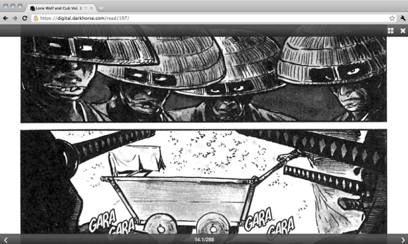
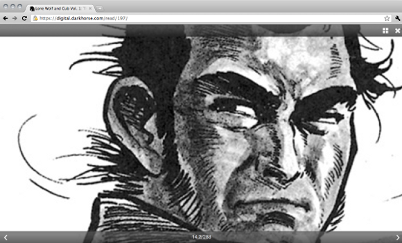
Here, fast forward to about 0:30 and pay attention to the camera. It’s the same effect.
That type of transition doesn’t, and cannot, happen in comics. It requires real motion, and it raises a lot of questions about where digital comics are going to go from here. Are they gonna be just simple transplants, or is someone gonna take advantage of this way of reading comics to the fullest extent? That transition is something new and entirely accidental. It was inconceivable when Koike and Kojima created that page, and I doubt Dark Horse went through and set up the zooms for dramatic effect. One day somebody ill is going to dig into digital comics and leave everybody else behind in the dust. Real, raw comics with next-level storytelling, no gimmicks.
As much as I’d love to explain why the different between digital and print is interesting, I don’t have the vocabulary for it yet. I’m not Frank Santoro. Not even close. I’m just a guy who reads and likes to talk about what he read. Sometimes my reach exceeds my grasp. Sometimes I miss things.
But it’s nice to think that I could one day learn enough to be on that level. There’s so much to learn. It’s exciting, like putting together a puzzle. There’s unlimited potential. Being better than some wack writer on another site isn’t enough. I need to be better than I am right now.

You’re absolutely right; I first noticed the gutter spacing in manga a year or two ago and was absolutely mortified I never saw it before, it was so simple. You’ve got me wondering when it started being the norm. Just going through my shelf real quick, it looks like Tezuka didn’t try this (or if he did it was much later in his career), though honestly it looks like he didn’t have a consistent measurement for his gutters at all. Shirato Sanpei didn’t in Legend of Kamui, which was in… the early 70’s? I see it pop up here and there in Barefoot Gen, but only when he’s trying to fit 3 panels in one tier. …
Daaaaamnm, apparently it was in use as early as 1970, Ryoichi Ikegami in Spider-Man: the Manga. Next closest is Otomo in Domu and Rumiko Takahashi in Maison Ikkoku, both in 1980.
Random aside: Really glad Oliff colored over the tones instead of trying to replace them since they add so much texture and personality to the city. Hell, I wouldn’t mind seeing more tones in full-color comics in general. They make Norm Breyfogle’s Batman and the art in Tank Girl charming as all hell.
Also, the kung fu closeup makes me thankful that film was ever invented.
Thank you thank you thank you thank you
I never noticed the gutters, but now I get to use it. GRATEFUL HANDSHAKES.
Love this article. Love the idea of digital comics doing innovative things with comics, rather then motion comics biting movies.
I know this is completely beside the point of the article, but that fight scene at the top is kind of bugging me. I’m trying to figure it out, but as far as I can tell, the third panel on the second page seems to be implying that Batwoman (who, to my knowledge, doesn’t have super strength) is yanking on that scorpion tale attachment hard enough to pull Scorpiana off her feet and fling her into that rock. With one hand, no less. I mean, maybe if she timed it with Scorpiana pulling the tail out of the rock, but to get her to fall that way she’d need to use some kind of circular motion. However, in that case, since the tail is attached to the back of her helmet that kind of motion should also force Scorpiana to turn her head, whereas she’s still looking straight ahead in the panel.
To put it in simpler terms, the way the characters are moving in this particular sequence just doesn’t seem right to me.
I notice that with a lot of comic book critics. They can spit endlessly about the narrative structure, the characterization, the symbolism and themes apparent in the story, but when they get to the artwork side of thing, it basically boils down to “It’s pretty to look at it”, “the storytelling is good”, or my personal favorite, “it’s realistic”.